For my last semester in the VisCom program, we are all assigned to a semester-long project. In this project, we all had the creative liberty to come up with what we would like to design. Within the desired project we had to prepare the overall concept, multiple deliverables, branding, print production, and presentation throughout the course. This project not only gave us creative liberty in producing something we are passionate about but also challenged us to practice our time management, speak to an audience about our work, and document all the steps.
For my project, I ended up creating Culinary Shuffle, a recipe deck of cards. I wanted to do something along the lines of a cookbook but decided to put a creative twist on that idea by making a recipe deck of cards that are user-friendly in the kitchen. There were a lot of challenges within this project like picking the correct size that is readable. This project was very time-consuming and a bit challenging, but I am so proud of the complete product!
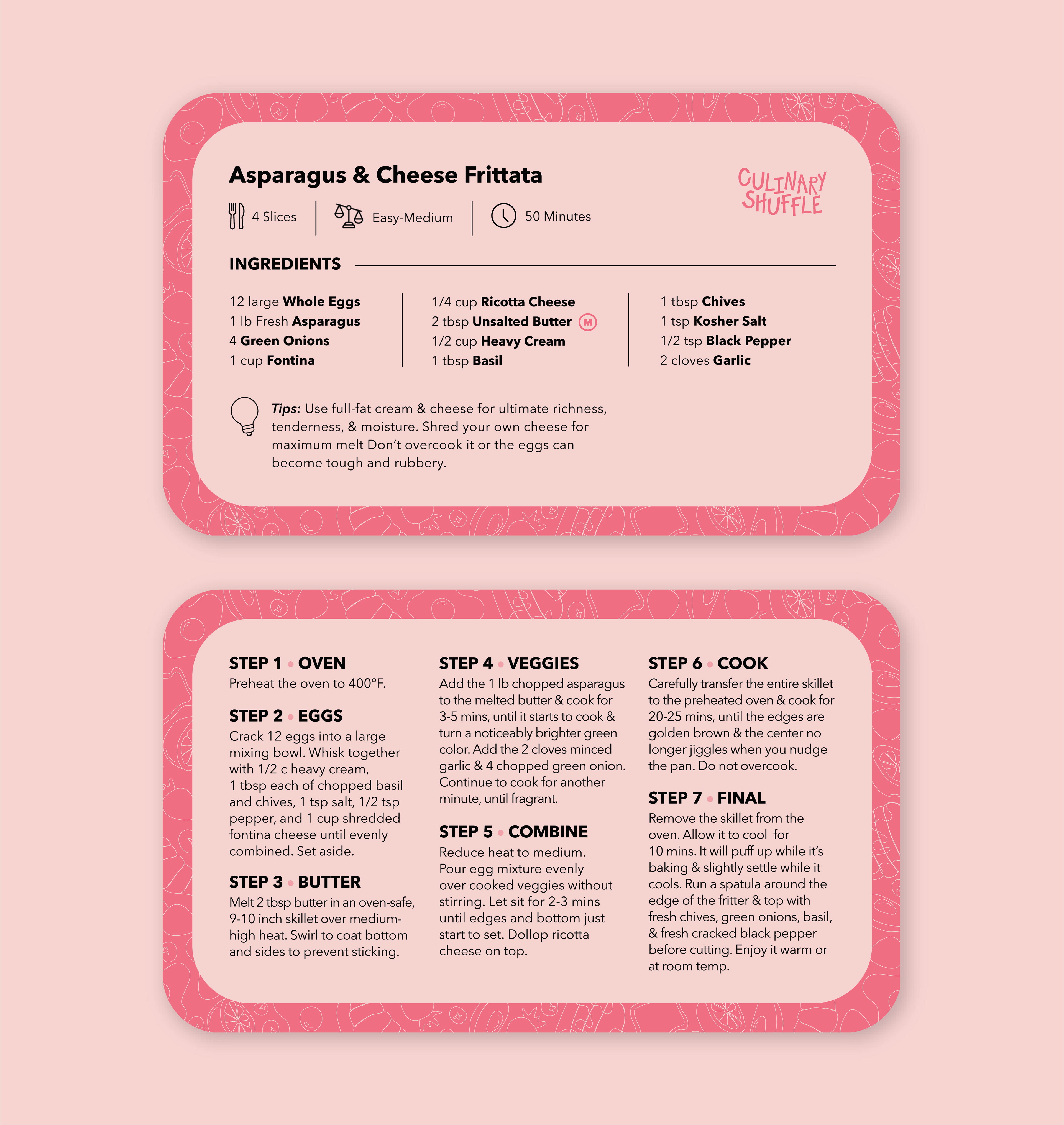
In the planning stage, I recognized the importance of organizing recipes into distinct categories to enhance the user experience when selecting a recipe. Ultimately, I divided them into four sections: breakfast, lunch, dinner, and sweets. Each section contains 15 recipes, resulting in approximately 60 recipe cards per box. Below, I've showcased a sample recipe from each section. On the front card, I chose a custom grid layout that incorporates serving sizes, difficulty levels, timing, and ingredients.
Additionally, a tip section, represented by a light bulb icon, is prominently featured on most recipe cards. Instead of bolding the measurements in the ingredients list as commonly seen, I opted to emphasize specific ingredients for improved readability and to prevent repetitive wording. The concise instructions are located on the back of the card. Each step is bolded and labeled according to its relevance to the recipe. Within each step, I also included measurements to streamline the cooking process and minimize the need to constantly refer back to the card.
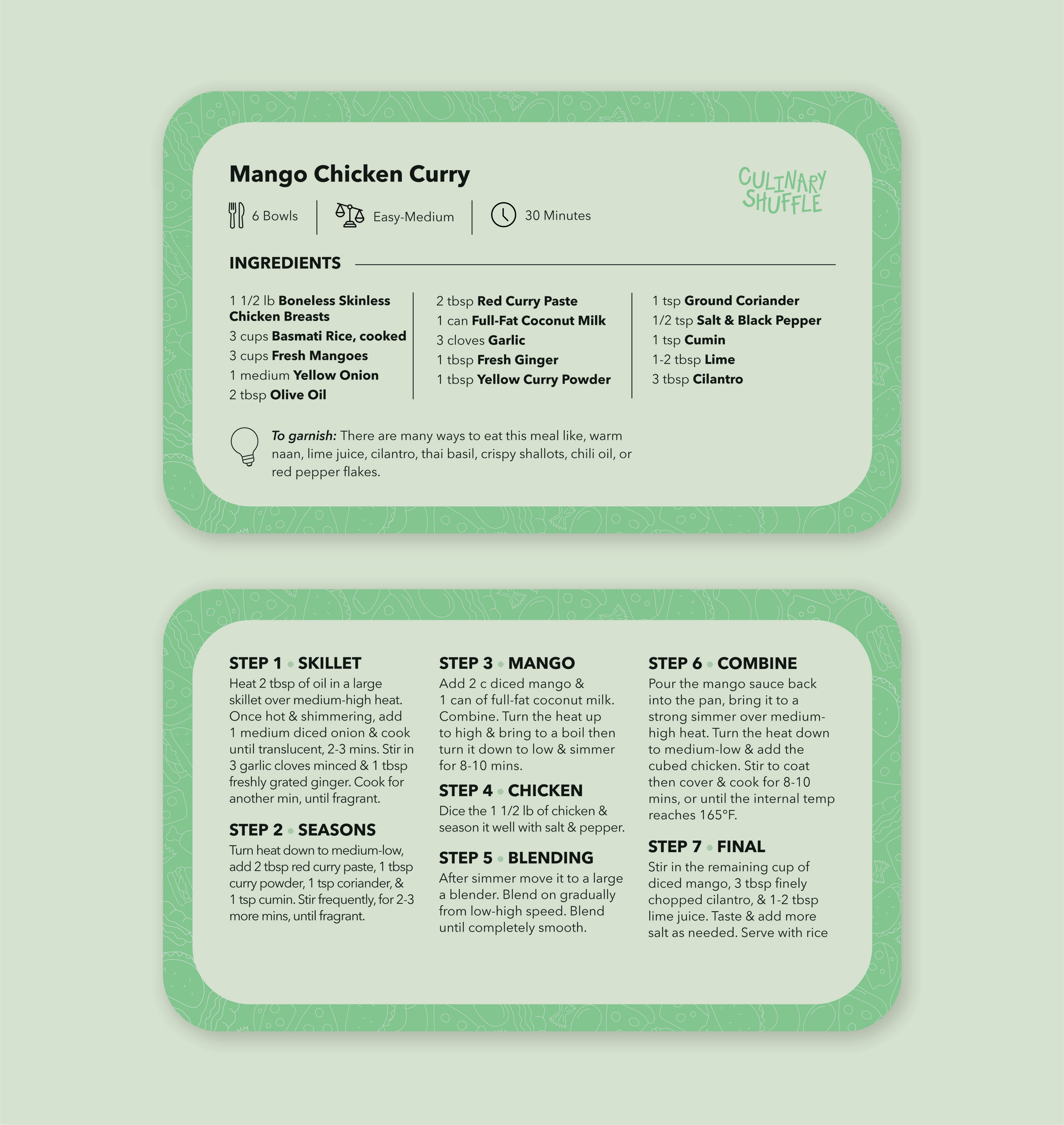
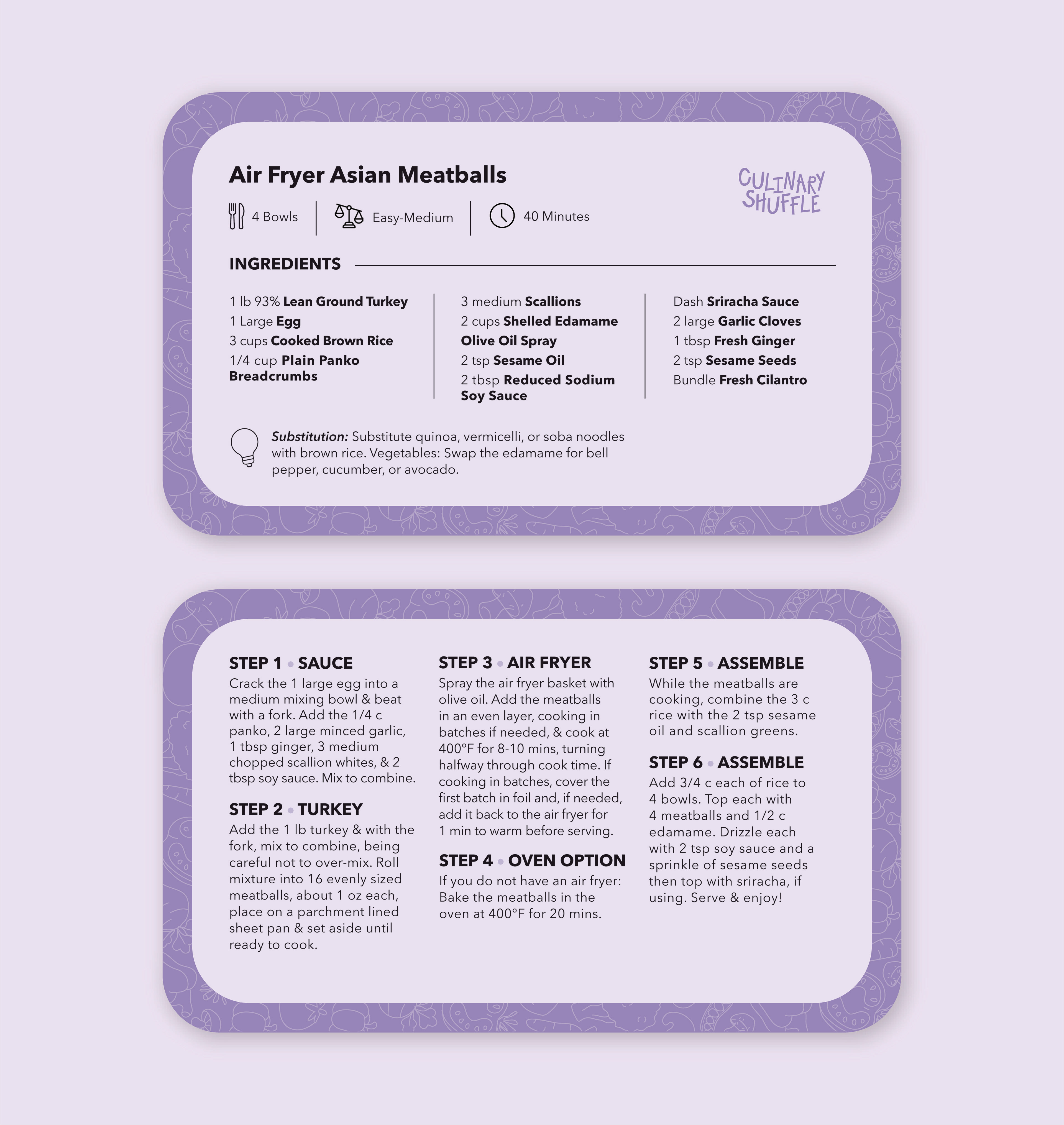
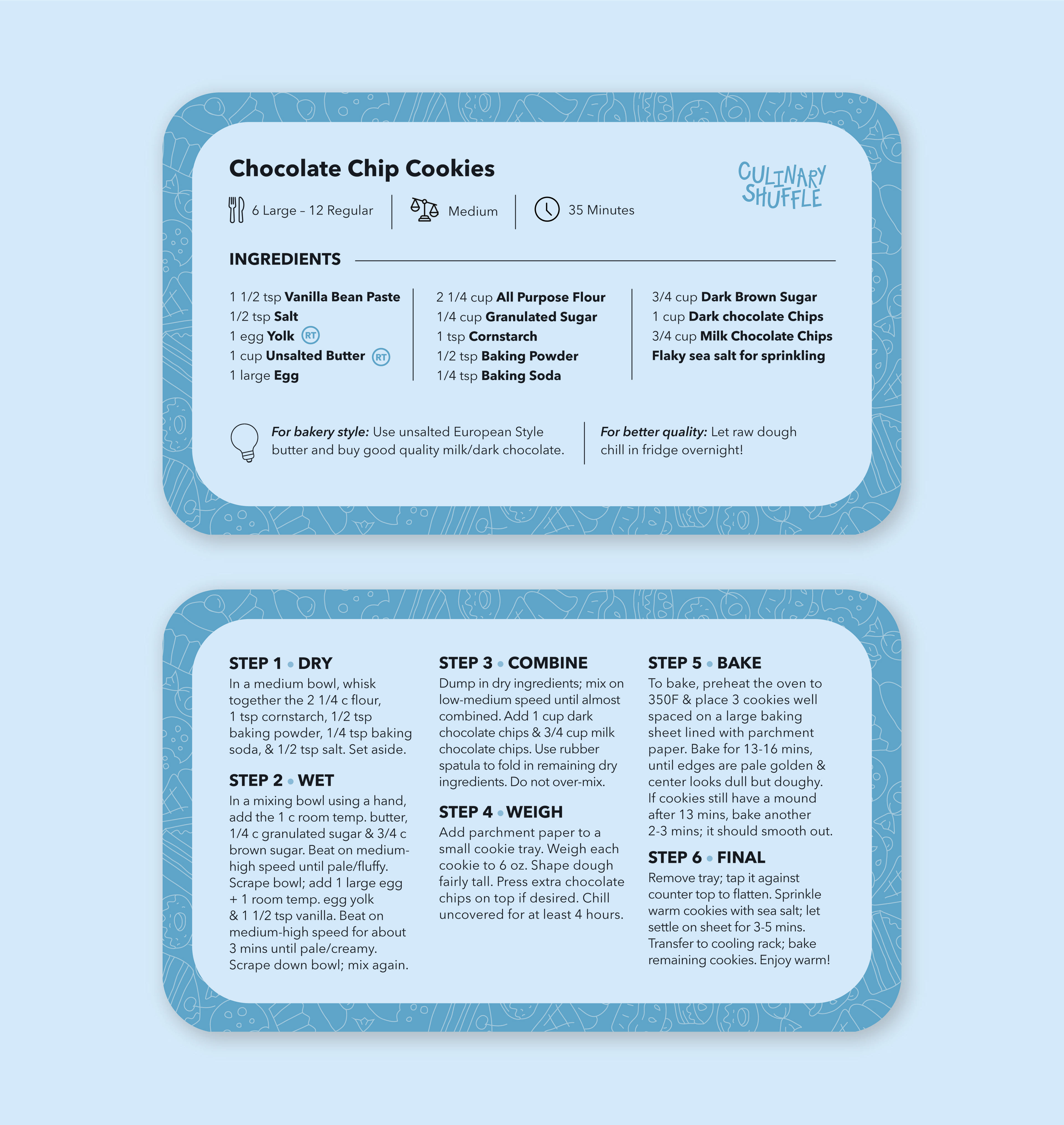
Welcome & key card
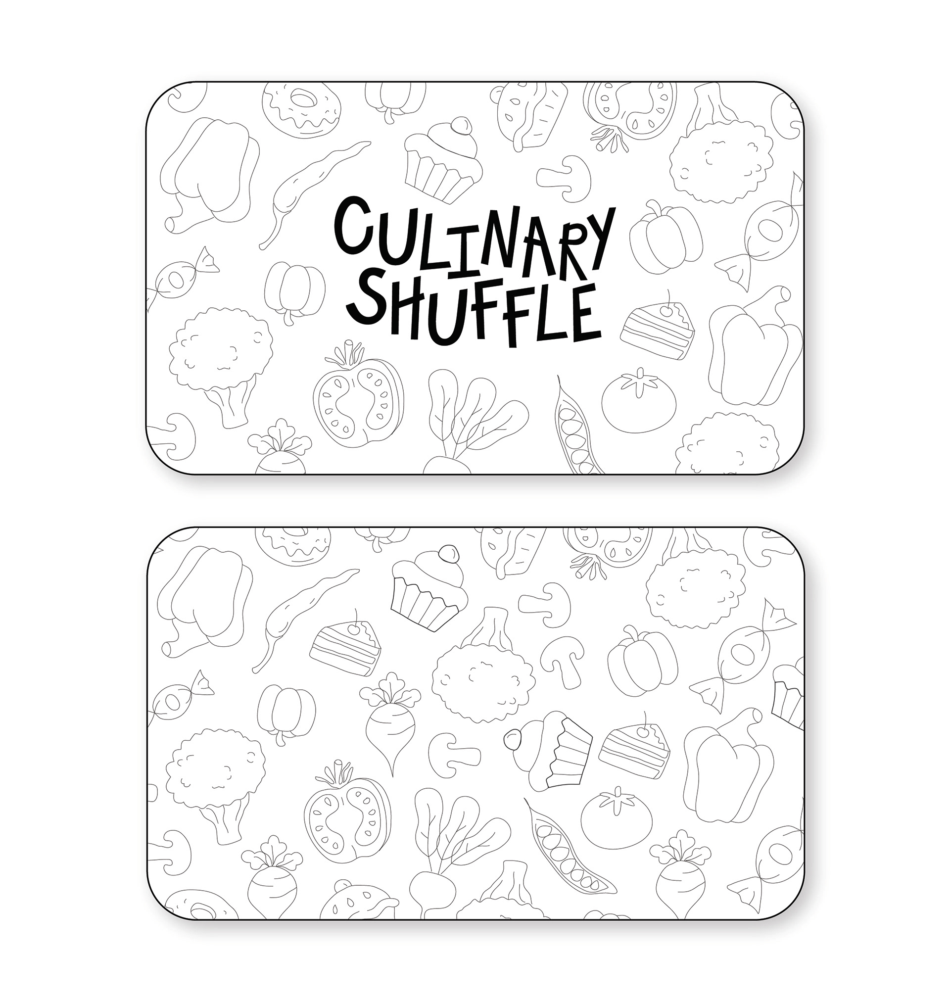
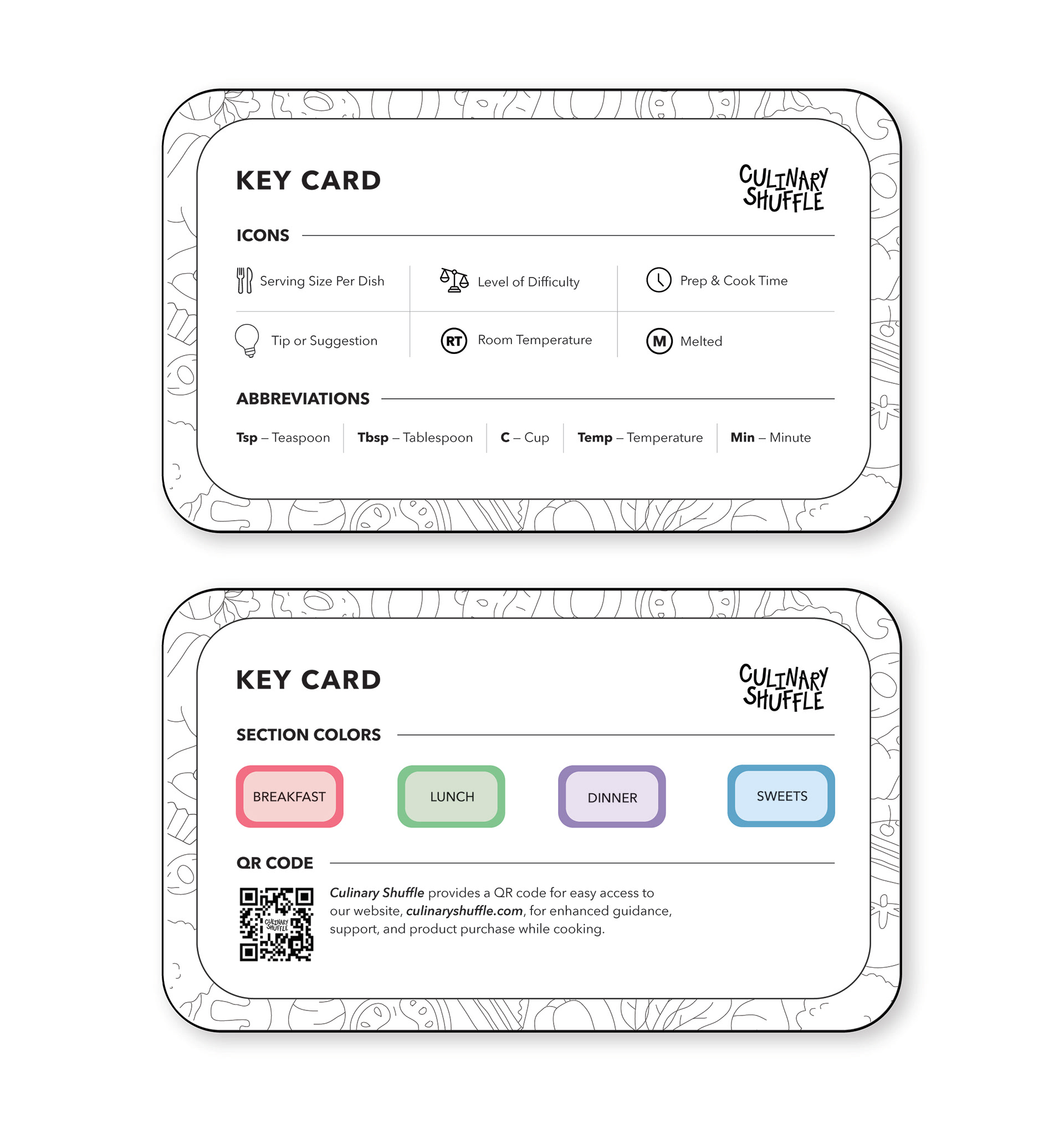
These cards are featured at the front of each deck of cards. The welcome card serves the branding purpose of this product. The key card is used to help direct the users with the icons, abbreviations, and section colors.
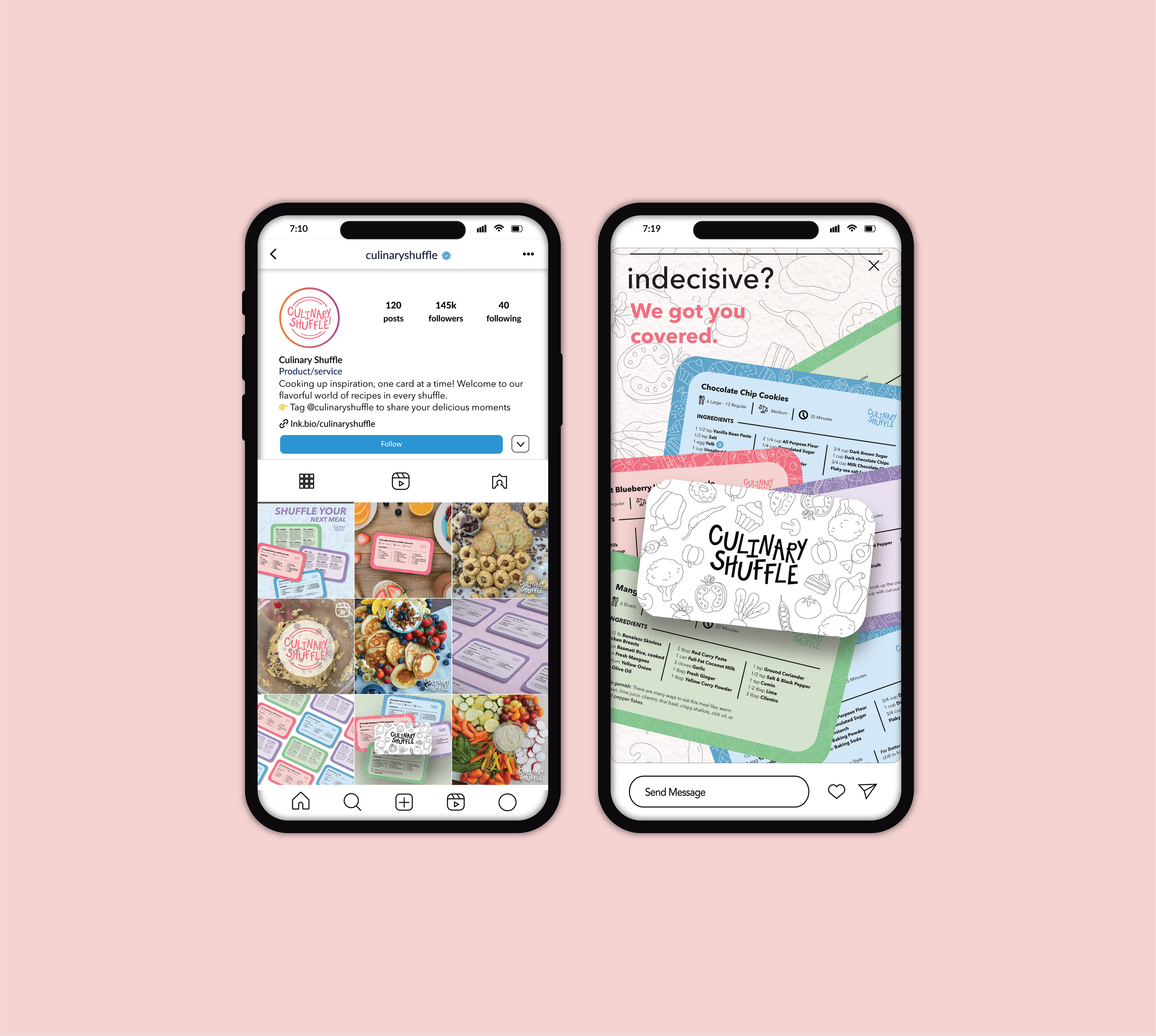
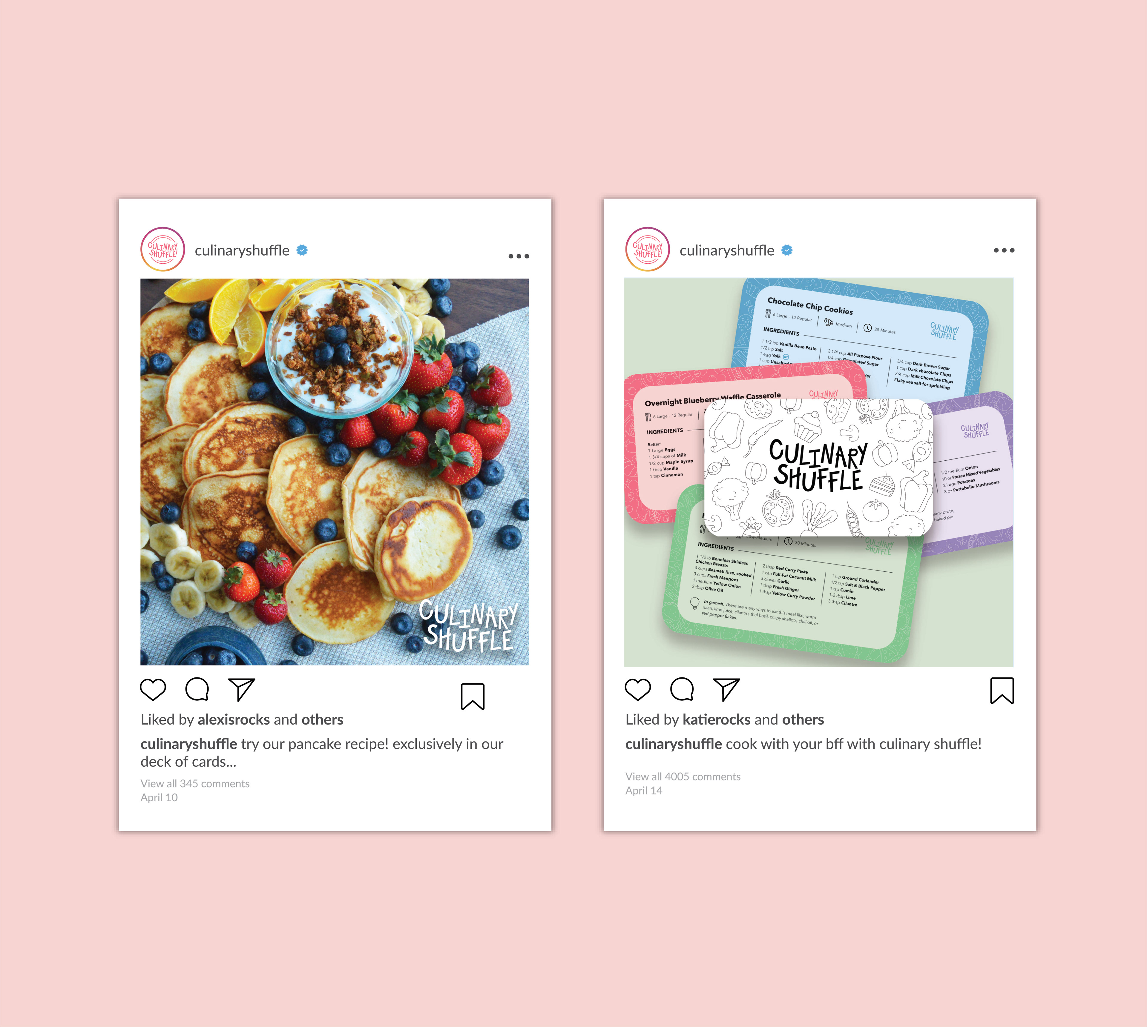
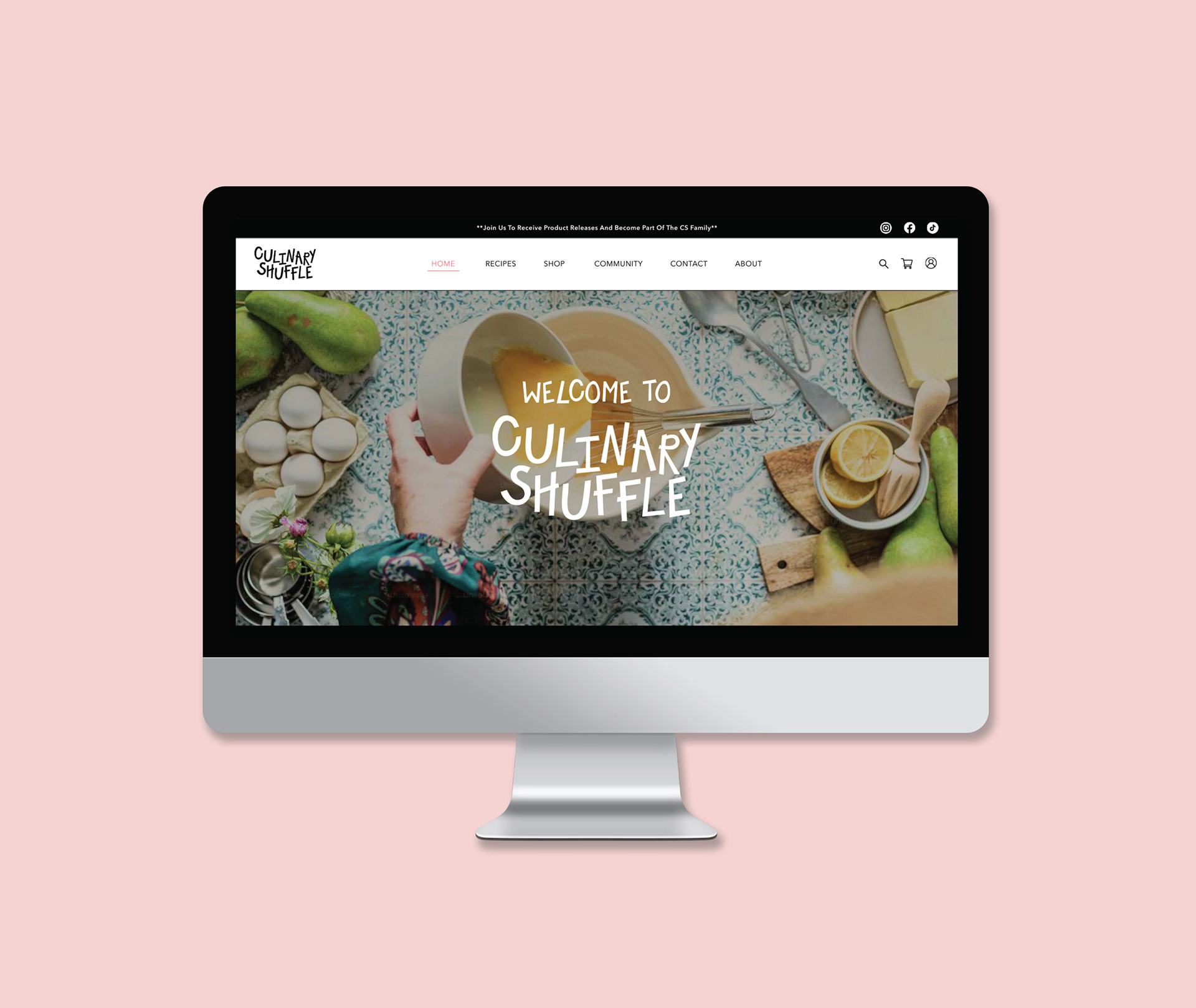
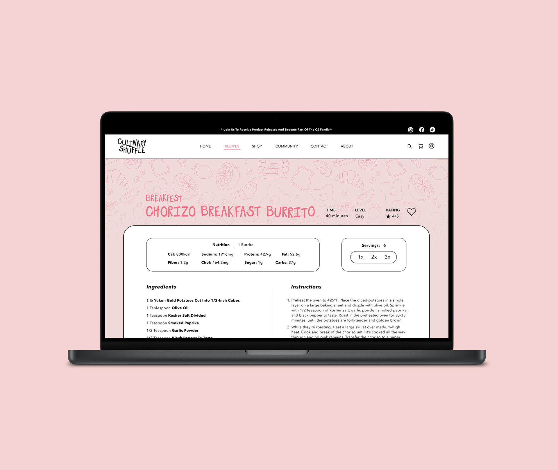
Social media & Website mockups
